


Looking to add a little life and movement to your website without diving into JavaScript? You’re in the right place. Animations can completely transform the user experience on a webpage — they draw attention, provide feedback, and make your site feel dynamic and engaging. And the best part? You don’t need to be a front-end expert to get started. In this guide, we’re going to show you how to create a simple CSS animation using just a few lines of code.
Whether you’re designing a button that gently grows when hovered over, building a loader for a content section, or just experimenting with subtle visual flourishes, CSS animations give you the tools to do it quickly and efficiently. This tutorial is crafted specifically for beginners — no complex theory or advanced techniques — just straightforward examples you can understand, customize, and use right away.
By the end of this article, you’ll know how to create a basic CSS hover effect, build a smooth CSS loading animation, and understand how CSS @keyframes bring your ideas to life. Whether you’re a student, a freelancer, or just learning for fun, these easy steps will help you level up your web design skills with confidence.
If you’ve ever wanted to make your website feel more alive, adding a simple CSS animation is one of the easiest and most fun ways to do it. Whether you’re building a personal blog or working on a client’s landing page, a touch of movement can catch attention and make your site look more polished.
In this tutorial, we’ll walk you through how to create a few types of simple CSS animations using pure CSS — no JavaScript required! You’ll learn how to make a smooth CSS hover effect, a basic CSS loading animation, and understand the magic behind keyframes. Let’s dive in.
What Is a Simple CSS Animation?
A simple CSS animation is a motion or visual transition created using the CSS @keyframes rule and animation-related properties like transition, transform, and animation. The best part? You can do all of this without writing a single line of JavaScript.
These animations are great for:
- Drawing attention to buttons
- Making loaders for your website
- Enhancing hover effects on images or links
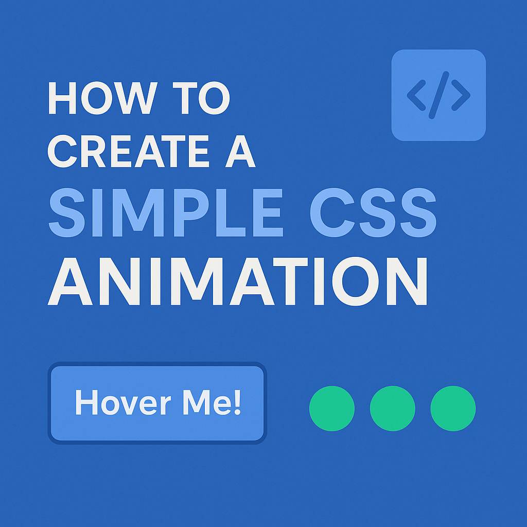
Let’s Start with a CSS Hover Effect
A CSS hover effect is one of the simplest ways to add interactivity. Here’s an example of how to create a button that changes color and grows slightly when you hover over it:
<button class="hover-btn">Hover Me!</button>.hover-btn {
padding: 12px 24px;
background-color: #3498db;
color: white;
border: none;
border-radius: 6px;
transition: background-color 0.3s ease, transform 0.3s ease;
}
.hover-btn:hover {
background-color: #2980b9;
transform: scale(1.05);
}With just a few lines, you’ve created a simple CSS animation that feels smooth and interactive. The transition property makes sure the change isn’t instant, giving it a fluid effect.
Creating a CSS Loading Animation
Next up is a CSS loading animation — perfect when you’re waiting for content to load or want to give feedback that something is happening.
Let’s build a bouncing dot loader:
<div class="loader">
  <span></span><span></span><span></span>
</div>
.loader span {
display: inline-block;
width: 10px;
height: 10px;
margin: 5px;
background: #2ecc71;
border-radius: 50%;
animation: bounce 0.6s infinite ease-in-out;
}
.loader span:nth-child(2) {
animation-delay: 0.2s;
}
.loader span:nth-child(3) {
animation-delay: 0.4s;
}
@keyframes bounce {
0%, 80%, 100% {
transform: translateY(0);
}
40% {
transform: translateY(-10px);
}
}This little animation is visually pleasing, easy to implement, and doesn’t require any images or libraries. A great example of a simple CSS animation in action!
Pro Tips for Better CSS Animations
- Keep it subtle – Overuse of animation can overwhelm users.
- Respect motion sensitivity – Use media queries to reduce animation for users who prefer it.
- Use
will-changewisely – This can improve performance when animating properties liketransform.
External Resources
- MDN Web Docs: CSS Animations
- CSS-Tricks: Understanding Transitions
- Google Web.dev: Animations Guide
- Web Design services
Wrapping Up
Adding a simple CSS animation to your website is a great way to enhance user experience and make your pages feel modern and interactive. Whether it’s a smooth CSS hover effect or a creative CSS loading animation, you now have the tools to bring your web elements to life.
Try these examples on your next project, and don’t be afraid to experiment. Happy coding!
Looking to make your website more engaging without compromising performance? Mastering simple CSS animation is the key to creating sleek, attention-grabbing interactions that keep users on your page. From hover effects to smooth transitions, CSS animations can elevate user experience while maintaining fast load times—crucial for SEO and conversion. At Kickoff Advertising, we specialize in blending smart animation with stunning visuals. Ready to bring your site to life? Let our expert web design service turn static pages into dynamic, high-converting experiences that reflect your brand and boost results.